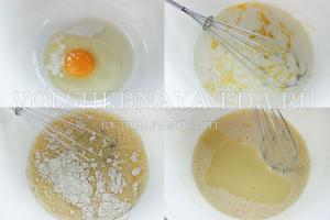
Green is a versatile color that goes with most shades. According to Feng Shui, it is considered a symbol of energy, renewal, growth. According to the 5 element theory, green color symbolizes the tree. It is familiar to the human eye and evokes pleasant associations with nature.
Interesting! Green color relieves psychological stress and irritability. It is the residents of cities who show an increased interest in green color - they want to take a break from urbanization and surround themselves with soft natural shades.
Despite the merits of green, not all designers like to work with it. This color has a lot of undertones, so you need to choose the “company” for them carefully. Depending on what tone was added to the main one, green can become cold or warm.

The most popular shades of green for interior decor
- Gray and blue-green. Most often used for well-lit rooms, adds coolness.
- yellow green. Suitable for poorly lit rooms where it is not cozy enough.
- light green. Considered neutral and calming. Can become the basis of any interior.
- Emerald. Most often used as accents. Background emerald distracts attention from the rest of the interior.
- Olive. Quite a calm shade, most often used in combination with white or bright yellow.
- Khaki. Expressive, but not annoying coloring. Interior decoration will depend on the accents you choose.
- Herbal. A bright shade, the excess of which can make the room too colorful. Such interiors are cheerful and active.
Important! Designers advise using no more than 2 shades of green. It is not advisable to decorate walls and furnishings in similar colors. Focus on one thing.
The use of green in different interiors
The main interior styles in green tones:
- Oriental. Both cold and warm tones are actively used. Pay Special attention on shades of malachite, emerald, olive and khaki. As auxiliary colors, we recommend choosing rich blue and yellow, accentuated with gold decor.

- Tropical. The basis of the interior can be a light green or pistachio shade, combine it with natural tones. Choose your accessories carefully: wicker furniture, live plants in tubs, flying curtains, bamboo rugs create that very “tropical” atmosphere.

- Nautical. Light green can be combined with turquoise and deep blue. Green can be actively used both in textiles and in furnishing elements.

- Art-deco. This style requires exemplary luxury, so pay attention to dark and rich shades - jade, emerald, malachite. Complete the interior with crystal decor, metal or gold elements.

- Eco style. As a basis, it is better to choose a neutral shade - white or sand, and enter green accentuated (carpets, sofa cushions, curtains, live plants).

- Country. Choose light, sun-bleached shades of green. It goes well with pastel colors. Artificially aged furniture and plain print textiles will perfectly complement the atmosphere.

- Mediterranean. It is characterized by bright colors: red, blue, yellow can become an addition. Natural fabrics, original prints, combinations of textures give this style a special charm.

TOP-5 advantages of a "green" interior
- Green shades do not irritate the eyes, so they are suitable for decorating both rest rooms and workrooms.
- Green color relieves fatigue, helps to strengthen the immune system.
- Green color is universal and has a lot of shades: cold tones will make the room lighter and cooler, warm shades will bring coziness.
- It can be combined with the most daring combinations, it is used both as a main background and as an accent.
- With the help of green, you can correct the defects of the room and visually expand the boundaries. A light green ceiling will make the room appear taller. If you want to draw attention to the surface - make it saturated green.

Advice! Best of all, green is combined with neutral natural shades. Be careful with acidic and flashy shades, they can simplify the interior and make it tasteless.
The combination of green with other colors in the interior
The Best and Worst Color Combinations
| Green+ | Featured Styles | Recommendations |
|---|---|---|
| The best color combinations | ||
| White | Classic, Provence, Eco-style | It goes well with light and dark tones of green. Visually enlarges the room. |
| Beige | Classic, Eco-style, Mediterranean | It is important to choose the right shade of green, otherwise the interior will merge and be faded. |
| Brown | Oriental, Ethno, Eco-style | It is recommended to choose green as the background color, and brown as accents. |
| Black | Art Deco, Ethno, Oriental | The interior gets dramatic and contrasting, it is recommended to add a third color - gray or gold. |
| Red | Art Deco, Mediterranean, Oriental | Choose soft shades of red - pink, raspberry, burgundy. Scarlet blends worse. |
| Blue | Marine, Mediterranean, Country | The lighter the green, the more saturated the blue tint can be. Light grassy with dark sky blue looks great. |
| Orange | Eastern, Ethno, Mediterranean | Orange is better to choose for accents. For the background, it is lightened to light red. |
| Grey | Art Deco, Classic, Loft | Try to play on contrasts: one shade should be an order of magnitude darker, otherwise the interior will merge |
| It is not recommended to combine | ||
| Violet | These colors are opposite and do not harmonize with each other. The exception is light lilac, it can be combined with herbal, for example, in the Provence style. | |
| light blue | These tones are related, and can easily merge with each other, you need another contrasting shade. | |
| acid shades | Draw attention to themselves, the interior seems artificial and unnatural | |
Advice! If you want monochrome green interior, play with contrast and saturation. This technique will help to carry out zoning and visually hide possible defects.
The best color combinations with green in the interior
Green + white. Well dilutes and softens all shades of green. A great move if you need to visually enlarge small area rooms. You can use 2 contrasting shades of green. If you paint darker niches or protruding columns, you can zone the room.


Green + beige. Beige in this tandem is the main tone, green is the accent. According to the designers, this combination is favorable for the nervous system. It is extremely difficult to spoil the design of a room in such shades.


Green + brown. Choose warm shades of green - grassy, lettuce, malachite. Cold tones harmonize worse with brown. With a dark chocolate color, the interior will be contrasting, with an imitation of light wood - light and bright.


Green + black. To avoid clear boundaries and excessive drama, add a third color to the design - gold, gray or beige. For bedrooms, a combination is chosen extremely rarely.


Green + red. Both shades should be warm, then the interior will turn out to be unobtrusive, but interesting. Against the background of red, green seems more expressive and deeper. However, there is a danger that such an interior will soon become annoying, so it is better to add white or beige accents.


Green + orange. Effective and bright union. Less irritable than green with red. You can add beige, chocolate, navy or White color as an accent.


Green + blue. It is interesting to combine light green shades with a rich blue tone. Be sure to think about the backlight: with different levels of lighting, the colors will appear deeper.


Green + gray. A classic cool range, you can add white or pearl blue - an ideal choice for interiors in Art Deco or Modern style.


Most often, matte surfaces are chosen for the interior in green, this color is unpretentious and does not require shine. However, if the concept requires it, rely on lighting: multi-level lamps will emphasize even the smallest details. Chrome and mirror surfaces have the right to exist, but their excess will look unnatural.
Photos of interiors in green color combinations
In the kitchen, green looks especially beneficial. It is recommended to use both restrained tones and bright shades.


Green is often used in living room interior decor. As a rule, it is used as an auxiliary color and to create bright accents.


In the interior of the bedroom, green is often used in combination with white, beige and light brown colors. As noted above, it is this combination that gives rest to the eyes and has a relaxing effect.


Green color is also appropriate for decorating the interior of the bathroom. Mostly saturated light colors are used.


Green color in the interior is ideal for creating a natural and relaxing atmosphere. It is versatile and practical. You can change the room at any time by adding a new color to it.
The combination of blue in clothes fascinates and attracts attention. This color is noble and luxurious. You want to drown in it, drink it to the bottom, dissolve in the deep blue. Blue is universal and democratic, airy and saturated. This is the color of the sky, the ocean, the mysterious lagoon, the dark sea ... It looks great on noble materials such as silk, velvet, satin. It's impossible to look at him. Perhaps that is why things of blue color in the wardrobe is always the most favorite.


Features and Benefits
In the entire color palette, blue is the most controversial and mysterious. The peculiarity is that it has many shades of different saturation. They can evoke interesting associations. Blue is a natural color. Its contrast makes any image unforgettable and original. This color creates a special mood.


The advantage of the blue scale is that it gives solemnity and status even to simple everyday clothes. Blue is a universal shade. It fits perfectly into the wardrobe of men and women. Stylists recommend using blue at any time of the year. It looks beautiful on shoes, jewelry, bags.


It is easy to pick up successful combinations to blue color, but it should be remembered that it does not harmonize with bright red. This combination irritates and awakens aggressiveness due to the high contrast. It is best to wear blue clothes with red accessories, not things. You should not combine blue with pink, purple.
Remember that the blue color carries severity, detachment, restraint. At the same time, it is dynamic and light.


What does
Blue color brings good luck, it means eternity, symbolizes the sky, lightness and airiness. Deep blue and royal - the color of honesty, chastity, kindness, good fame, fidelity. He is able to soothe nervous system, eliminate bad feeling and distraction. Blue color is associated with stability, peace, reflection. It drowns out passion and contains some kind of mystery.


Those who love blue have special traits: melancholy, slight insecurity, modesty, honesty. Such people prefer peace, love loneliness, avoid noisy companies. At the same time, blue is the color of luxury, grandeur, wealth, tranquility, generosity, insubordination.

Who suits
Blue color is deep, cold and contrasting. It perfectly suits girls of the "winter" and "summer" color types - brunettes and brown-haired women. In this case, choose calm dark blue shades: royal blue, sapphire, navy. Girls with a cold color type "winter" will suit ink colors, sea waves, sky blue. You should also pay attention to neon blue: electric blue, indigo and cornflower blue.

Girls "summer" is better to choose soft and light shades of blue. Aquamarine, forget-me-not, blue. The color types "autumn" and "spring" are ideal for a warm shade of blue - turquoise. Pay attention to the color sea wave, Navy blue. Other shades can also be used, but it is desirable that the blue color is not close to the face, but is in the background.

Combination of blue with other colors
Blue is one of the most popular colors in a fashionista's wardrobe. It pairs well with opposite shades. With blue clothes, it is easy to create diverse bows, avoiding monotony.
- burgundy. An attractive and delicious ripe cherry color that is hard to resist. The combination of burgundy and blue is based on contrast. Passion and energy are mixed with calmness and balance. If you combine burgundy with dark shades of blue, you get a discreet and noble look. Bright blue and burgundy will look spectacular and stylish.

- Brown. Harmonious, calm and creative combination. Brown and blue have the same origin. They are natural, natural colors that are associated with earth and sky. Most beautiful combination it will turn out if you combine ultramarine and brown in one set. Sapphire goes well with light brown. Stylists advise combining light blue shades with dark brown and vice versa.

- Green. Great natural combination. The color of greenery and deep lake inspires many designers and stylists to create original images. It looks interesting dark blue color with various shades of green. In this case, dark blue does not seem so gloomy and cold.

- Violet. Good combination of blue and purple creates a sense of harmony and tranquility. Stylists advise combining these two shades in dark colors. The perfect combination of dark purple, cornflower blue or deep blue.

- Yellow. The combination of yellow and blue gives a summer mood. These are shades of the sun and the sea, so they look best on flowing and thin fabrics. A great office option will turn out if you wear a lemon-colored blouse and trousers or a skirt in a dark cornflower blue shade. The combination of yellow and blue looks great in everyday fashion. It refreshes and rejuvenates.

- Silver. Silver color perfectly harmonizes with contrasting colors. Blue is successfully combined with it, it looks solemn and luxurious. Stylists advise choosing silver shoes or other accessories for a blue dress or skirt.

- Lilac. Good combination of related colors. They complement each other and help create a beautiful and harmonious image. Do you want to add more bright notes to your outfit? Use purple and Pink colour, as well as white, black and beige accessories.

- Orange. Stylish and bright combination. An outfit with these shades looks elegant and romantic. Most often, orange and blue are found in summer sets. This harmonious combination can also be used in autumn. A blue coat and orange boots will make life brighter and cheer you up!

- Beige. A gentle and elegant combination will turn out if you combine beige, turquoise and electric in one set. Beige is a neutral color and against its background, many colors become a strong accent. Blue goes well with it.

- Grey. In one image, blue and gray look ambiguous. On the one hand, such a combination refreshes the image, on the other hand, it makes it boring. Stylists advise choosing the right shades of these colors. It is best to stay on gray with a bluish tone, and choose brighter blue. In the image, use white or beige accessories.


- Mustard. This color is associated with bitterness, spicy seasoning, so you should not joke with it. Blue and mustard - good combination which can grow into a great friendship. Stylists recommend choosing dark shades of blue, then the image is luxurious, soft and sophisticated.

Blue goes well with classic white and black. In the first case, it will be easy summer version, in the second - a slightly weighted, business image. Combining black and blue, choose bright shades. Perfect option- ultramarine.


Fashion trends
This season, the blue color in clothes is gaining popularity and strengthening its position. He is in the top ten trendy colors warm season. Designers offer fashionistas to pay attention to dark blue and transparent blue. The main color of the 2017 season is niagara. This classic denim shade is simple, comfortable and serene. Niagara is universal. It goes well with pastel, bright, contrasting shades, creates a balance in the image.


In most fashion collections, designers offer to pay attention to the deep and rich blue color - lapis lazuli. It symbolizes the bottom of the ocean. Intense and deep. Pairs well with yellow. At the peak of fashion, clothes are the color of sea water, illuminating azure and transparent blue. This color scheme looks great on summer dresses made of thin fabrics, coats, loose-fitting jumpers. Stylists advise to combine it with pale pink and neutral beige.

How to wear blue
Blue is multifaceted. It combines two opposite tones - pale blue, turquoise and heavy dark blue. Blue shades are associated with dreaminess, airiness, lightness, summer sky, and dark ones with serenity and balance. Remember that blue, regardless of its shades, can complete any look and complement your wardrobe. Light blue tones should be combined with contrasting dark blue, red, orange, brown.

Delicate blue color looks original with gold, gray, olive. It is not recommended to combine blue with green and pink. Electric accessories will decorate a golden dress or light brown trousers. Dark blue jeans or a skirt pair well with an olive blouse, red scarf, silver jewelry or accessories.
To create solemn evening looks, stylists recommend choosing blue in deep tones - a shade of twilight, ink. Keep in mind that deep dark color will add rigor along with and visually add age. For a party, informal events, it is best to choose bright blue colors - indigo and electric blue.

Shades in men's fashion
The blue color is perfect. It attracts attention and is considered a good alternative to black. Blue is present in men's fashion, but in more restrained shades. The most popular colors that go to men are metallic blue, dark blue, deep, sapphire, ultramarine. The dark blue color is attractive. It can be used to create an office, business image.


Instead of a classic black suit, stylists recommend wearing a dark blue version. The blue metallic shade is complex and ambiguous. If you want to create a stylish image, approach the process carefully. Everything must be perfect. A suit of this shade is a luxurious option. It looks great at a gala event or a formal party.


Sapphire-colored clothes are beautiful and rich. The coloring decorates any outfit, but does not make it heavier, it looks expensive and noble. Ultramarine is a bright blue hue compared to others. This is a luxurious and expensive color. An interesting and stylish look is obtained by wearing an ultramarine jacket, white shirt, jeans, suede shoes in dark blue.


How to choose jewelry
When choosing jewelry, you should take into account many different factors, such as the style of clothing, the shade of blue, and the type of girl. A classic blue dress is in harmony with massive jewelry and jewelry. They will make the image spectacular. If a dress, blouse or skirt has ruffles, flounces, inserts, assemblies, then it is not recommended to overload the image with additional accessories.


Blue items are in perfect harmony with jewelry made of silver and white gold. Choose quality jewelry. A blue blouse with a yellow or massive necklace will look beautiful. It goes well with blue jewelry gold, red, orange color. Natural shades - green, blue and green refresh the image and are in perfect harmony with the blue.


When choosing jewelry, consider the features of appearance. Fragile, thin girls should not choose too massive necklaces and bracelets. It will look appropriate and advantageous if, in addition to the voluminous necklace, it will no longer be in the form of large accessories. Full girls should also follow this rule: massive jewelry makes the image heavier in in large numbers, so it is better to stay on long massive earrings.
The influence of flowers on a person is a scientifically proven fact. In order to live comfortably, you need to choose the right combination of colors in the interior. It is not so easy. There are special rules that must be followed in order for the colors to be compatible. There are also ready-made tables that make the whole process easier.
Principles and types of formation of combined colors
In nature, there are a huge number of shades of colors. But, as you probably noticed, not all of them look equally good next to each other. Some seemingly unexpected combinations are simply mesmerizing, while others are more likely to look away. This is because when choosing flowers for the interior, flower beds, bouquets, clothes, certain rules and principles must be followed.
The palette of matching colors can be from two to seven colors and shades.
To make them easier to remember, special tools were created - a color wheel and tables of matching colors. In principle, the main tool is a circle, and tables are the finished result of selection on it. If you want to learn the basics of color combinations, use a circle. Otherwise, select the option from the tables.
Color wheel and how to use it
The color wheel has three levels. Inside contains the primary colors - red, blue, yellow. They are called primary. Their pairwise combination gives three additional (secondary) colors - purple, orange, green. At the third level, tertiary colors are placed - this is the result of a combination of secondary and primary. Based on these colors, they select a combination of colors in the interior (and not only).

Color matching wheel - for selecting basic colors for the interior
As you can see, black, gray and white are not represented in the circle. They do not exist in nature in their pure form; in interior design they can be used as basic (white and gray) or additional.
Number of colors
Before explaining the rules for using the color wheel, you need to understand the number of colors for their harmonious combination. In general, two, three or four matching shades can be used. You can also add universal ones to them - white, gray, black. This is exactly what decorators and artists do.

There are many flowers, but in one interior they look harmonious. This is because they are chosen correctly - they are combined with each other
But for the interior, two shades are too monotonous and boring. Much more interesting room decorated with a combination of three, four or more colors. At the same time, it is wrong to use colors in equal proportions. One or two of them are chosen as the main ones, there are "many" of them. Walls, floors are painted in these colors, they are present in furniture upholstery, textiles. One or two more are used as additional ones. There are not many of them, but they are noticeable. The rest - no matter how many there are - serve to add variety and accents. They are present in small quantities - these are decor details, pillows, etc. If you look closely at the interiors that you like, you will most likely find such a pattern in the distribution of colors.
The combination of colors in the interior based on the color wheel
Using the color wheel, you can choose matching colors from it. They do it according to certain rules. There are several principles for the formation of combinations:

Only by these principles it is possible to form several dozen combinations. But there are still extremely distant pairs and four colors that can be combined. It also adds more options.

But that's not all. Each of the colors in the circle changes in saturation, from lighter in the middle to darker on the outside. That is, in the selected sector, you can pick up several shades by tone. This combination of colors in the interior is called monochrome. They are also used in design.

Within the same color, you can take several shades, add strokes of neutral colors - that's the finished monochrome interior.
It's fun to play with color sometimes. And in order not to be too boring, you can use “universal” as accents - black, white, gray or red - to taste, depending on the desired mood and purpose of the room.
Color combination tables in the interior
It may be interesting to choose a combination of colors in the interior, but out of ignorance, you can make mistakes. For simplicity, tables have been created that simplify the creation of the interior. Especially if you know how to use them.

Table of color combinations in the interior - several options
In the color tables, the combination of colors in the interior is given in the amount of five to six shades. They must be used in accordance with the rule. The first shade is the main color, the second and third are additional, the rest are accent. This is how you distribute colors.
In such tables, look in the first position for the shade that you want to make dominant. Having tried, you can find three or more options. After all, there are tables that are compiled according to contrast, complementary, etc. principles. So there are many options. For example, in the above piece of tables (in fact, there are a lot of such sheets), there are two combinations for bright blue: 127 and 135. There will be even more of them on other sheets. From the options found, choose the combination of colors in the interior that suits you best.

There are tables that have a different look: they have a dominant shade located perpendicular to the additional and accent. The rules for using tables of matching colors do not change from this. Only the main color is highlighted, making it a little easier to navigate.
Photo examples of interiors indicating the used color combination
The fact that colors affect mood and well-being has been talked about for a long time. There is even such a direction of alternative medicine as color therapy, where different kind violations are treated by being in the interior with a predominance of a certain shade. So the "mood" of each color should be kept in mind when choosing a palette.

Red: matching colors
Red color is very active and aggressive. Usually it is present in interiors as accents - to break the monotony of design in white, gray or beige colors. In this case, it is almost indispensable - it enlivens the picture very well. You can see for yourself - below are a few photos. Red in the interior of the living room is only in this version, and maybe, otherwise the inhabitants increase anxiety, health problems may even begin.
The main one in this interior is milky white, the additional one is brown and beige, the accents are green and red. Approximately the same range, but for the living room in a different style - instead of green, there are black details, which gives more "coldness" to the atmosphere.
The place where red can be the dominant color is the kitchen. Here you need high activity and this color will give you cheerfulness. And, at the same time, it will also increase your appetite.
If you need a similar effect, please choose a combination of red as the main one. As an additional gray goes with it, shades of white, beige, black details can be found. You can still find a little green - in the form of plants or a few details. Other colors are rarely woven, otherwise it turns out too colorful even for the kitchen.
Combination with gray
Gray is a soft, so-called base color, with which any others are combined. For interiors living rooms this is one of the best options. There are several ways to form the right combination of colors in an interior with predominant gray. They take two or three shades from the gray scale, add one or two shades of another color and get a very harmonious design.

In the photo above, the interior of the bedroom is formed according to this principle. Light gray in them is the main one, two more saturated shades are additional. As accents, blue (complementary shades) are used in one case, and pastel pinks in the other.
By the way, brown ones also look good with gray, and if you add raspberry, yellow, orange as an accent - warm shades - you get a very cozy and “warm” interior that is suitable for a bedroom, a girl’s room, and applies to kitchen design.

Gray in the kitchen also looks very good. It is suitable for creating interiors in loft, hi-tech, modern style. In this room, everything can be even simpler: add one bright one to three or four shades of gray - yellow, red, orange, blue, green. In one of the bright and warm shades. It turns out a very unusual and not at all dull combination.

Raspberry and yellow as accents - create a mood
In general, interiors in gray - with any accents - are somewhat chilly. For a kitchen, this is not bad, especially if it faces south. Such combinations are also good in the corridor / hallway. In those interiors where there are at least two warm shades with gray, and the interior turns out to be warmer, it is quite suitable for bedrooms and living rooms.
Beige and matching colors
Beige in the interior is an even more versatile color. Like everyone else, it has warm and cold shades, but in any case, it creates an atmosphere of comfort and reliability. You can create a monochrome interior based on beige colors. This option is for lovers of discreet interiors. This combination of colors in the interior is typical for the classics.

Beige gamma with brown additional - comfort and tranquility
If you need solidity, add brown, any color splashes are suitable for more lightness - as is the case with gray. Add cold shades of color spots to cold shades of beige, and warm shades to warm ones.
For accents, add one or two bright or pastel color splashes - depending on the effect you want to create.
Beige can be chosen as the main one. The walls and floor are then painted in it - in lighter shades. Furniture is chosen darker, but also beige or brown. Add a few accents of bright colors. That's all, the harmonious interior is ready.
Pick colors for furniture
Often, when choosing colors for an interior, they are tied to existing furniture. For such cases, there is also a table of compatible shades. It is not difficult to work with it: in the right column you choose the color of the furniture, in the middle column are written friendly colors, in the far left those that are incompatible.

But do not use all possible colors. In addition to the color of the furniture, three to five more colors may be present. At the same time, the basic ones - white, gray, black - are also considered. So don't overdo it.
Thinking through the design of any interior, you should carefully approach the selection colors. It is she who has a powerful psycho-emotional and energy impact on a person. Therefore, it is important to choose exactly those colors that will bring harmony to the atmosphere of the house. In this process, it is necessary to correctly use the combination of colors in the interior: a table of harmonious combinations will help turn even an ordinary room into an absolutely perfect place.
When creating a design, you need to build on not only your preferences, but also follow certain rules. Their observance will ensure the result of more high level. Many specialists develop on this basis the whole science of coloristic design of premises.

The main highlights are as follows:
- a correctly chosen basis is the foundation for further decoration;
- all colors are divided into two groups - cold and warm colors, which must be taken into account when combining them;
- warm colors will give comfort to a large room;
- a small area will visually increase due to the cold palette;
- when choosing shades for kitchen design, one should remember the statement that some colors can increase appetite, while others, on the contrary, will oppress it;
- the color palette of the bedroom should contribute to relaxation - both moral and physical;
- the choice of tones for the living room is selected to satisfy most preferences;
- the choice of style is the determining basis for which colors to use;
- it is desirable to think over everything as thoroughly as possible: color can change the overall picture, both for the better and for the worse.

Style combinations of colors and their influence on a person's mood
Each style has defining tones, therefore, when applying a certain style direction in the design, one should take into account the correspondences shown in the table:
| Style | Color |
| Provence | Light pink, milky, blue |
| Eco - style | Swamp and brown |
| Baroque | Pastel shades |
| Classical | Mandatory presence of white |
| High tech | Grey, black, white |
| Modern | Brown-beige, blue, green |
| Minimalism | black and white |
| Futurism | White, lemon yellow, ultramarine, light green |
| Pin-up | Light pink and warm yellow |
| Country | Sand, light yellow, brown |
| Loft | Orange, red, blue, green |
Following these dependencies will not allow you to make a gross mistake in the process of work.

Do not forget about the influences exerted by certain colors:
| Hue | Influence on a person's mood |
| Shades of yellow and green | Optimism, calmness, peace, fatigue reduction, relaxation |
| Pastel shades of yellow, beige | Creating comfort, peace of mind, making compromise decisions |
| Turquoise | Feeling of lightness, freshness |
| Blue | Calmness, peace, good sleep |
| Yellow and orange | Warmth, comfort, tone of the whole organism, stimulation of active parts of the brain |
| White | An excellent background for any design decision, cleanliness, order, inspiration, but its abundance brings coldness to the room |
| Black | Suitable for graphic types of interior, can give gloom, gloominess |
| Grey | Always looks businesslike, regardless of the use of bright accents |
Color wheel color combinations: the basic principle of use
For a successful selection of the design of any room, use a circle of color combinations. Its structure consists of 12 sectors. Each sector contains one color, or rather all its shades. Grading comes from light tone in the center to dark at the edge of the circle.
The spectrum begins with three primary colors: blue, yellow and red. Further, when they are mixed, secondary shades appear: purple, green and orange. Accordingly, then the secondary and primary colors are mixed, and as a result, tertiary combinations are obtained.

Using this circle, you can choose a color palette of several different directions:
- Monochrome type.
- complementary combination.
- harmonious type.
The monochromatic type is based on the use of only one color segment. The combination of colors among themselves here occurs from light to dark shades of the same color. Such a monochrome approach is quite rare. It is not always possible to do without any contrasting inclusions.
Complementary combination gives a very high quality, bright design. Using colors that are diametrically opposed, small compositions are created, but they are very effectively staged. the right accents. For example, according to this principle, the following pairs are used:
- combination turquoise color in the interior with red;
- a combination of purple with yellow-green;
- combination in the interior of green with red-violet.

Classic combinations: a base of three and four colors
The harmonious type is based on the use of one main, two supporting and one additional - black or white.
The main variation of this approach is the triad. The combination of colors of the color wheel is based on the use of 3 equidistant colors. In the photo of color combinations in the interior, one can note the choice of one main and 2 supporting shades. Such a combination is often found not only in works made by man, but also in the wild. This proves the absolute correctness of its use.
As an option, many consider the analog triad. Take 3 colors located side by side on the circle. One is the main one, the second is supporting, the third is accentuating. In the future, based on this principle, a very correct design line is built.
Separately, it is necessary to mention the contrasting triad. Here you need to take the main color and find it diametrically opposite. But in combination with the main one, add not him, but two colors adjacent to it. The result is a softer, less flashy use of tones.
There are correct combinations based not only on three colors, which are called triads, but also on the basis of four. Known rectangular scheme, in which the colors are complementary in pairs. In this option, 1 is the main one, and the rest are auxiliary. For example, good for combining beige colour in the interior with other colors are blue, brown, emerald.

Another option would be to good decision: Use colors in a square pattern. This action is similar to the previous one, but the only difference is that the colors are equidistant from each other.
The combination of colors in the interior: a table, basic rules and directions
To create a fashionable image of your home, you need to have an elementary concept of a combination of colors. Applying a color wheel is not always easy to use. Therefore, they often resort to the help of certain tables in which you do not need to calculate something yourself, but everything has already been selected by specialists. Therefore, it is easy to determine the most original combination flowers in the interior of the living room or in another room.
Such tables can be presented in the form of a large set of colors, between which the degree of compatibility is marked. Having independently combined the two shades, it is already clear whether it is worth using them or whether you need to think about a more correct choice.

There are also tables that contain ready-made solutions. This is a collection of four tones that are most successfully combined with each other. Using such simple examples you can easily choose the most harmonious option for any room. Their construction is also based on the colors of the color combination circle.
Some of the charts on the left have the main base hue stacked vertically. Further, there are several color ranges: possible shades of the same color, possible shades of other colors and several contrasting shades.
Examples of table combinations
The combination of turquoise color in the interior with other shades in the form of ready-made tables can be presented with certain names, such as “summer dreams”, “meeting in a coffee shop”, “lime kiss”, etc. This color is able to highlight softly and unobtrusively the right details premises. A variety of its shades from dark azure to delicate aquamarine gives designers a wide field for action.
The combination of green in the interior can also be found in the form ready-made solutions. If, for example, you take a light green shade, then an excellent result will be obtained when used with eggplant, purple, burgundy, warm yellow and orange. Gentle has been very popular lately mint tone, which is in perfect harmony with white, silver and light brown tones.

If you take a deep and rich dark green as a basis, then it will already be combined with cold shades of red, lemon yellow. The dark olive shade of the walls is good in combination in the interior of the colors of the curtains and wallpaper in a dark brown or white shade with contrasting accents of pink.
Using such simple ready-made combination tables, the result of the interior of any room will be very good, even without the additional help of specially trained designers.
The combination of colors in the interior of the kitchen: photos of good ideas
Qualitatively thought-out components of kitchen design will give the most positive result. Here you need to take into account the decoration of walls, ceiling, floor, selected furniture. The main selection criterion for the above parameters will be the color scheme. In this matter, experts most often come to this decision: if the walls are made in bright, defiant colors, then kitchen furniture should be executed in calm bed colors. And vice versa.
Frequently used layout kitchen sets"under the tree". In this case, a good combination of colors in the interior with brown will give cream, pink, bright blue, green and beige. Based on the choice of such a palette, you can distribute your favorite colors between the finishes. different parts premises.
Recently, high-tech kitchens have been especially popular. The base color of this design is grey. Despite the fact that it is considered boring and purely businesslike, dark pink, red, purple and bright blue have a great combination of colors with gray in the interior.

Important rules when planning a kitchen interior
Creating a design for a specific line is based on several rules:
- having chosen the main color and its complementary ones, it should be remembered that it can look different on different surface textures;
- contrasting colors are very often used for zoning a room;
- in order to diversify a monophonic interior, they resort to the help of drawings, lines, geometric shapes.
Related article:
Professional advice for those who make repairs with their own hands. Preparing walls for painting. Choice of trendy colors and textures.

Wanting to have a catchy and slightly defiant design, contrasting colors are used. But when decorating, you always need to feel a fine line, otherwise you can not avoid bad taste. The use of contrasting accents always makes the environment bright and impressive. For example, a combination of blue and metallic colors will brightly set off black. Even considering that he is deep, strict and sad, he will fit perfectly into this triad.
Helpful advice! The main basis for choosing a palette should be the following thesis: furniture is always darker than the walls, but lighter than the floor.

In addition to this, you need to remember the following correspondences:
- orange is combined with blue and gray;
- red - with white, gray and black;
- yellow - with purple;
- blue - with peach;
- lilac - with green.
After that, the full gamut is built. Photos of color combinations also show that glossy surfaces expand the saturation, depth of tones, while matte surfaces do the opposite. Using this fact, you can effectively play on the variety of materials offered and achieve the most desired result.
The combination of color with other colors in the interior of the living room
The directly proportional dependence of the interior-purpose has to correct selection living room colors. If it is used only for receiving guests and family gatherings, then it would be best to use shades that promote long-term communication, leisurely and naturally flowing rest, spending fun event. This room sets the overall balance of beauty and comfort in the house, therefore, it requires increased attention when decorating.

Helpful advice! Red tones with gold will give a sense of celebration, green and olive - a craving for mind games and reading. The combination of purple and, for example, gray will set certain accents and enliven friendly gatherings.
But not always the central room of a house or apartment can only be used for its intended purpose. Very often, it also favorably combines the functions of a bedroom.
In this case, the owners have to find the perfect compromise in design solution. Depending on the temperament, you can choose good options. However, one should not forget about the effect of color on sleep and rest. More restrained tones, combinations of beige in the interior, turquoise, lavender, emerald and azure will give a feeling complete relaxation in the bedroom and at the same time will look harmonious in the living room.

If the walls are beige, the combination of colors in the interior of the living room will be an easy choice for the owners. After all, the basic beige shade is the ideal basis for almost any color solution. You can choose a lot of options for any direction. This approach is often used because of its versatility. In the situation of using one room for a different functional load, it leads to the need for its clear zoning.
To avoid overloading the space with various racks, niches or screens, it will be correct to use a color palette for the distribution of the territory. This tactic is very often applicable and is famous for good feedback about yourself. After all, how pleasant it is to be in a room in which everything is free and at the same time clearly structured.
Photos of two-color wallpaper combinations in the living room clearly demonstrate the possibility of zoning the room to increase its functionality. And at the same time gives it a special feature. Beautifully selected tones with this reception will make the interior original.
The combination of colors in the interior of the bedroom: colors and successful combinations
It's no secret that a good proper rest is the key to health. To ensure this important part of the life of each person, a room is required that best meets his individual needs.

It is necessary to design it in such a way that it is comfortable, pleasant and conducive to relaxation. The table of color combinations in the interior will make it possible to choose desired options. Depending on personal preferences, cold or warm tones are used, often resorting to the so-called color bleaching. This practice makes the favorite bright flashy shade more suitable for the break room.
When choosing, you need to remember that the number of colors cannot exceed 7, while everything is taken into account: the color of the ceiling, furniture, accessories, etc. The percentage of bright colors is 10. The more colors there are for decoration, the less bright they should be .
Bright style in the bedroom: the right tone solution
A photo of color combinations in the interior of the bedroom shows that the use of even deep red is well suited for creating modern design. This option will appeal to people with an active lifestyle. If you diversify this color a little, you can get another very fashionable look, which is based on a terracotta shade.

Based on such tones, many often resort to the use of golden blotches. Very good result will give a tandem of red and dark green. The combination of gold with a brown tint will add depth and importance to the bedroom.
If you like red, but want a more relaxed atmosphere, then you can safely use scarlet or ocher. By combining with basic pastel colors, you can achieve and bright accent, and pious depth.
Use the color of cheerfulness and fun - orange in the bedroom with caution. It suits many active and mobile people. Its related tones such as pumpkin or tangerine are ideal for dominant coloring. Looks good in combination with ivory or beige.
If the choice clearly fell on yellow, then here you need to approach the issue very carefully. Specialists of design companies do not recommend using it as a local one. It would be best to apply a pear or corn shade.

Calm in the bedroom: how to achieve it with color
Most people tend to perceive the bedroom as a center of calm and tranquility, so they do not use bright saturated colors when decorating it. The choice most often falls on pastel colors. They contribute to practical rest and full restoration of physical and emotional strength.
Blue color is ideal for decorating rest rooms. It is boldly associated with water, its natural purity. According to the color combination table, it looks good with natural shades of wood and beige.
A surge of vivacity and purity of thoughts in full will provide green color. Using it as a base when decorating a room, this effect is easily achieved. To prevent the room from seeming a bit dull or gloomy, you can combine this color with neutrals such as white or light beige.
The combination of brown in the interior with beige, green or purple will add some mystery. The room will be cozy and calm. It is the brown shade that is chosen as a priority, and the rest will play a supporting role.

Many pastel shades are very well combined with each other, as they complement each other. Beige, cream and apricot carry positive energy. They often serve as the basis of the design line and are well shaded by other colors that act as bright contrasting accents.
High-tech style solution will be a combination of colors with gray in the interior. Ideally, it will look with the aforementioned red. Very common in Lately combination into one semantic picture of gray and lilac colors. Perfectly such a connection will be shaded by a furniture set in white or dark brown.
By itself, the gray tint can play a dual role in any design. Where necessary, he will emphasize the brightness of the other, and where necessary, he can muffle. To create a comfortable atmosphere in the bedroom, colors such as blue, green, pink or beige will also help him.

Note! Combination gray color in the interior fits well into various style solutions. That is why it is in great demand among the owners of modern apartments.
The combination of colors in the interior of the bedroom can be different, but there are some points that should be avoided. For example, contrasting solutions are a little out of place. Options such as orange with purple, yellow with blue, green and purple are not suitable for the interior of a break room. Their combinations are very colorful and defiant, they will not give you the opportunity to relax and unwind. Therefore, thinking through each step, you need to correctly analyze the situation and choose harmonious combinations.
In the closet of almost every girl, there is probably a dark blue sweater or other item of clothing in this color. After all, it will decorate most fashionistas. By itself, it is restrained and strict, but if it is diluted with other shades, then the look will completely change. That is why it is recommended for basic wardrobe.
Indigo or other dark colors make the hair look amazing. To show them in a winning light, you should consider simple recommendations:
- A similar bottom suits blondes, so you should pay attention to skirts or trousers.
- Red beauties will be decorated with a dark blue top, whether it be a blouse, T-shirt or jacket.
- Dark-haired women of fashion can afford any experiments with this color, any options will suit them. Including a dark blue coat.

Submission of world designers

celebrity images
Thinking over an outfit for the office, for a walk or a party, girls think about what color goes best with the chosen shade. It is worth figuring out which decisions will be successful, and which should be abandoned.

Basic color combinations
Universal options with white, gray and black
The set in which white is present is most suitable for a work environment. Moreover, it can be like an indigo color suit with a light blouse, and vice versa. White details will dilute the gloom, give the image of elegance.
Similar combinations in clothes and in Everyday life. A cozy white jumper looks good with dark trousers, on White dress you can put on a dark jacket. These two colors can be freely combined, so it's worth letting your imagination run wild.

Interpreted with white
Gray paired with blue must be handled with care. If both shades are saturated, then the image will turn out to be gloomy and boring. Therefore, if you already use them together, then give preference to light gray. Better yet, consider white accent. For example, such a set looks great and completely unbanal: a white blouse, a dark jacket and a gray skirt.

Combination with gray

Skins with black
Romantic pink and mysterious purple
Able to completely transform the look. He will get rid of the restraint of blue in clothes, give some playfulness and femininity. The image will turn out romantic and tender. Possible options: navy blue jacket combined with a pastel dress, rich raspberry jacket and indigo pants. A loose dress looks interesting if it is complemented with a bright pink bag.

Paired with bright colors pink
When choosing winter clothes, you should also pay attention to this color. Woolen things look cozy and soft.
The combination with purple is also worthy of attention. It turns out that such a set is sufficiently elegant and elegant, the woman in it looks mysterious and impregnable. Just remember that purple is better to choose light enough, then both colors will sparkle.

Duet with purple
Natural combinations with brown, green and khaki
When it comes to choosing an outfit for every day, it is good to wear navy blue along with brown or beige. Such an ensemble gives the image softness, it looks calm, but not boring at all. The combination is also suitable for an evening out. The indigo color dress will be complemented by neutral women's accessories: a clutch, pumps, a belt emphasizing the waist.

With brown color
The combination in clothes with green looks original and fresh. And any shades will do, from olive to mint. It is worth choosing those that are to the liking of the most fashionista.

Combinations with green
Harmonious sets with a touch of khaki.

Kits with a touch of khaki
Combination with warm shades: yellow, orange, red
Another boring solution is to combine with yellow. Such an image is bright, eye-catching. You can choose the brightest variations of yellow: a more restrained color will muffle them somewhat. Summer women's sets look interesting, for example, a long floor-length skirt and a sunny T-shirt or top.

In harmony with yellow shades
It will be no less successful. It is also bright and warm, so it can make the look gentle and feminine.

Packed with orange
Wearing blue is worth and.

Combined with coral shades
But red requires careful handling. Although these two shades are combined well, if you overdo it, the look will turn out to be vulgar. Therefore, it is better to use it as separate accents, it can be a handbag or shoes.

With red
Gold, silver, other shades of blue
All shades of blue are combined with gold and silver, both in jewelry and clothing. If you wear a golden jacket with a matching dress, then the ensemble will turn out to be very festive. Silver is no less relevant. When using it, the set should be supplemented with black details: shoes, clutch and jewelry.

Golden accents
Accessories - shoes, bags, belts - and jewelry of this shade complements ensembles in pastel colors and dresses with floral prints well.
Shades of one palette are well combined with each other. So a dark blue sweater can be safely worn together or with turquoise things. The outfit will only become more expressive.

With tones of turquoise and mint

In a related range
Actual clothes
Separately, women's dark blue trousers and a skirt can be noted. You should pay attention to them when compiling a basic wardrobe. They can be worn to a variety of events. To go to work, you can complement them with a classic white blouse, and a black or beige jacket will not be superfluous. A less strict option is a jumper and a scarf. If the question arose of which outfit to choose for a party, it is recommended to combine them with a golden top. Of course, these are not the only possible combinations. Universal color allows you to freely experiment.
Dark blue is appropriate in outerwear. A coat like this helps to create an elegant look, especially when worn with beige or brown boots and a bag. A lime scarf will add spice to the look.

Coat sets
Wedding participation
Dark blue can be taken to contrast white at a wedding celebration.

wedding accents

In solemn performance
Possibility to combine different shades will satisfy the taste of the most demanding beauty. It is only necessary to take into account the purpose for which the outfit is selected.